An easy guide for using colour to increase conversions
With a website, one of your primary goals is to increase conversions. There are many ways to achieve this goal with anything from adding more content, using social media, offering discounts and running competitions.
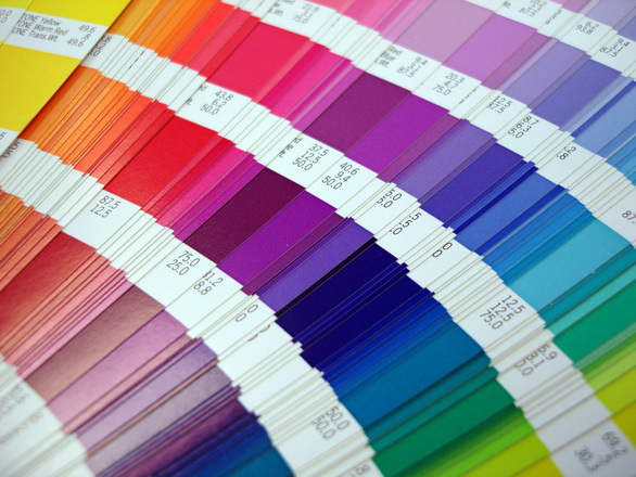
One of the least considered options and one that is often overlooked by small business owners is the power of colour in the buying process. Colour psychology is the study of how colour effects the way we behave and if we can connect with our customers on an emotional level using colour, then our sales and profits can increase dramatically.
Research into the impact of colour on marketing has demonstrated that people make decisions about products within 90 seconds of being exposed to the product or advertising material. Even more importantly, between 62% and 90% of their decision making process is based on colour.
Gender differences in colour preferences
There are specific differences in the colours favoured by men and women, as there are in the colours disliked by men and women. This means that if your company promotes to one gender or the other, colour is going to play a major factor in your advertisements, your website and your conversions.
For example, one of the oft cited studies on gender differences in colours found that surprisingly, the favourite colour of both men (57%) and women (35%) is blue. The second most favourite colour for men is green (14%) and for women is purple (23%).
On the other hand, the least favourite colour for men is brown (27%) with orange (22%) and purple (22%) coming in close second. For women, their least favourite colour is orange (33%) with brown coming in second (20%). Clearly, brown is not a good colour for increasing conversions in either men or women and it is this type of information that can have a profound effect on how you design your website, your landing pages and your promotional material.
Linking specific emotions with colours
The same study that found gender differences in colours, also found that some colours can be linked to specific words. For example, the word ‘trust’ is associated mainly with the colour blue (34%) and white (21%). So if you need to build trust with your audience, then using blue and white in your website’s design, promotions and landing pages is one way to associate this emotion with your brand.
Likewise, the word ‘security’ has been shown to be associated with blue (28%), black (16%) and green (12%), ‘high-tech’ with black (26%), blue (23%) and grey (23%), and ‘reliability’ with blue (43%) and black (24%). So if your business deals in technology, digital products or home security for example, focusing on the colours blue, black and grey seems like a very good idea.
Then we have the colour black (43%) and blue (20%) being associated with the words ‘high quality” and orange (30%) and brown (23%) being associated with ‘low quality’, which might be why both men and women dislike orange and brown.
From these results, it goes without saying that a brown or orange BUY BUTTON on your ecommerce website is not such a good idea. On the other hand, a blue BUY BUTTON would appeal to both men and women and might well help to increase your conversions.
Then again, some large companies such as Amazon, use orange banners to promote a feeling of fun or urgency, so there are exceptions to these generalities.
Don’t forget that men tend to prefer bold colours, while women tend to prefer more demure or pastel shades. Also that people like to combine colours that are closely matched on the colour wheel and that they don’t like too many colours used together.
So whilst there are some common factors in colour psychology, you can’t take all of this as gospel. It is essential to test different colours and combinations to find the ones that work for your business and increase your conversions.
Choosing colours for your call to actions
A quick search of the internet reveals that red, green, orange and yellow tend to be the most popular colours for call to action buttons, whilst black, white and brown are the least popular. The main rule of thumb is that your call to action buttons need to stand out from the background of your web page, they shouldn’t clash with your overall design colours and they need to grab people’s attention.
The best way to start using colour psychology on your website is to begin with the most popular colours and to use A/B testing to identify which colours or combination of colours convert better than others.
For help with increasing sales and conversions on your website, contact us on 02 8097 7957, email us at hello@conversionworx.com.au or complete our online enquiry form.